manthey kula as
Akkarvikodden
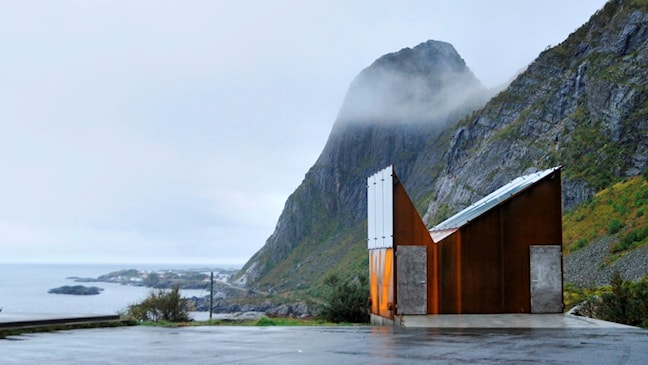
Akkarvikodden offers the best reflection of the profile of the Norwegian Scenic Route Lofoten, with horizontal planes and bold lines.
- Landscape architect:
- Landskapsfabrikken AS - Inge Dahlman
- Architect:
- manthey kula as
- Finished:
- 2009

The main idea behind the design of this rest area was to raise a podium in the landscape to reflect the ocean surface, the horizon and the mountains behind the site. A long concrete terrace has been placed on the promontory near the open ocean. The groups of furniture on the terrace are placed in a rotated fashion, so that visitors must actively choose their own position in relation to the surroundings. At the back, the rest area is bordered by a natural stone wall that establishes a precise visual delimitation towards the mountains and screens the site off from the road. The terrace and the tables are made of concrete, while the benches and walls are cut from local Lødingen granite at various stages of processing.
The service building appears as a clean-cut geometrical shape which is closed off from its surroundings and open to the light from the sky. The dramatic landscape is blocked out. From a distance, the building is perceived as a landmark.
The rest area is designed by Landskapsfabrikken AS - Inge Dahlman
The service building is designed by manthey kula as
Myrbærholmbrua
The combination of keen anglers and motor vehicle traffic gave rise to a lot of concern on the Atlantic Road.
- Architect:
- manthey kula as
- Finished:
- 2010

To improve traffic safety and introduce some order, two anglers’ bridges were constructed over a length of 80 and 100 metres respectively. One of these anglers’ bridges ends in a circular platform provided with benches. On the other side of the bridge, stairs lead down to the rock from where travellers can safely try their hand at fishing.
Skreda
A mound planted with willows, grass and white clover creates a nice atmosphere and provides shelter from noise and traffic.
- Architect:
- manthey kula as
- Finished:
- 2018

In addition, the rest area had a large information wall that had not been maintained. The old building was stripped, unused rooms were torn down and the rest of the building was resurfaced in a neutral and sturdy material. The area towards the northeast, which previously was blocked by the building, now has a great view towards Offersøystraumen. The new building, the information boards and the light poles make up a sober but still characteristic stopping place along the road. The rest area itself has been opened up towards the sea, and the old furniture has been replaced with sculpturally shaped furniture in a colourful pattern that gives the place a distinctive character.